

Use Colour Bias to Unlock the Secret of Oil-Paint Mixing
- Richard Mitchell

- Apr 14, 2024
- 9 min read
Updated: Nov 7, 2025
Mixing Oil Paints with my Friend John

When I first started painting in the early nineties, I went to some art classes run by my dear friend John Hutchins, who sadly has since passed on. In an early class he shared this colour bias approach for mixing oil paints to get the colour you want. I still use it to this day, though I have since embellished it by adding other colours. It never had a name that I learned, so I’ll simply call it the Colour Bias Method. Here’s a picture I painted of John, thirty years ago.
Picking Six Colour Bias Oil-Paint Colours
We start with the three primary colours, red, blue and yellow. As we learn in our childhood, we can combine these colours to make green (blue/yellow), violet (blue/red) and orange (red/yellow).
Here’s how it gets interesting.
Instead of picking a single red, we pick a violet-biased red and an orange-biased red. By a violet-biased red I mean a red that leans more towards violet, and a perfect choice is Alizarin Crimson. This is a deep, burgundy red. But what about an orange-biased red? Here we pick something much closer to a traditional pure ‘red’, and the recommended colour is Cadmium Red.
Instead of a single yellow, we pick a green-biased yellow and an orange-biased yellow. The recommended colours in this case are, following the same order, Lemon Yellow and Cadmium Yellow.
So far so good. Now let’s turn our attention to the blues.
In this case we need a violet-biased blue, for which we will use French Ultramarine, and a green-biased blue, for which we will use Cerulean Blue. French Ultramarine is a deep, dark blue, usually simply called 'Ultramarine'. Cerulean is a light, bright blue. Cerulean sometimes gets spelled in different ways (for example, 'Coeruleum') but you can usually spot what it is.
In summary, we have picked six bias colours, and they are:

1. Ultramarine Blue (violet-biased)
2. Cerulean Blue (green-biased)
3. Lemon Yellow (green-biased)
4. Cadmium Yellow (orange-biased)
5. Cadmium Red (orange-biased)
6. Alizarin Crimson (violet-biased)
As you can see from the picture, if we arrange these colours in a circle or a ‘colour wheel’, they fit perfectly beside each other, including the loop round from Ultramarine to Alizarin Crimson.
Now let’s see what delicious colours we can mix with these six colours.
Mixing the Primary Colours

We can mix a ‘perfect’ red by blending Alizarin Crimson with Cadmium Red. But note that by varying the amount of each, we can push the red more towards orange or violet. Along the same lines, a perfect blue comes from French Ultramarine and Cerulean Blue, and a perfect yellow from Cadmium Yellow and Lemon Yellow. By varying the balance of the mix, we tweak the red, blue or yellow primary colours in the bias direction we want.
One thing’s for sure – they are all strong, vibrant colours. In summary, we now have a set of reds, blues and yellows.
Mixing the Secondary Colours
Now let’s turn our attention to the bias colours.

Our perfect green comes from a blend of Cadmium Yellow and Cerulean Blue. You’ll find it mixes a bright, acidic green, and again you can vary the green by varying the amount of yellow or blue in the mix. The best way to find out what happens is to take a blank sheet of paper and experiment with mixing different amounts. You’ll find there’s quite a range.
For a bright orange, we mix Cadmium Red and Cadmium Yellow. Again, we can adjust the balance. So if we are looking for a reddish orange, for example, we can add more Cadmium Red. If we overshoot with too much red, a bit more Cadmium Yellow will put us back on track.
For violet, we mix French Ultramarine Blue with Alizarin Crimson. This will produce quite a dark violet, but we’ll deal with that in a minute. For now, you can make it more purple by increasing the French Ultramarine, or more violet by increasing the Alizarin Crimson.
All these secondary colours will be strong, and not ‘muddy’, where too many colours have been mixed in together. But what if they are too bright? What if you need to dull them down to get the colour you are seeking?
We’ll address that next. For now, we have a nice set of greens, oranges and violets.
Mixing Dull Colours

The first thing you notice when you’re trying to mix the exact colour you want is that you cannot always get to it simply by varying the amounts of the two biased colours. For example, if we mix Lemon Yellow with Cerulean Blue, we are always going to get a bright green that jumps off the canvas and socks us in the eye!
But what happens if we mix French Ultramarine with Lemon Yellow? We are now introducing a bit of violet (from the violet-biased French Ultramarine), and that dulls down the resulting green. This time as we vary the colour balances we mix, we get a different set of greens.

And guess what – if we mix Cerulean Blue with Cadmium Yellow, we now introduce a smidgen of orange into the mix (from the Cadmium Yellow), and – yes, you’ve guessed it – we get a distinct set of greens yet again.

If that isn’t enough food for thought, get your test piece of paper and try mixing a green from French Ultramarine and Cadmium Yellow! Now we’ve got a little bit of both violet and orange in the mix, and we are going to get a dull, muddy set of greens as we adjust the balance. Don’t panic –sometimes that’s exactly what we want!
In summary, by deliberately choosing one or both of the colours biased in the wrong direction, we can mix many different greens from our two blues and our two yellows. The same goes for violets and oranges – we can muddy them to the degree we want, in the same way. The picture shows the possibilities with green, but I left out the same possibilities with orange and violet so that the picture didn’t get too crowded.
The Seventh Colour
As we are working in oils here, we cannot always lighten the colour by thinning it, as we might with watercolour. We can thin with linseed oil, for example, but it simply becomes transparent and let’s the colour underneath shine through. If what's beneath isn’t white, the colour doesn’t lighten.
We need to add a seventh colour. It is Titanium White. You can use it with the six colours previously mentioned, and add a tiny dash to see the difference. Wow! That gloomy old violet suddenly lit up like a beacon! Have a play and you’ll find that now you can, by adding more and more white to any of the above combinations, produce a vast array of colours. For example, a blushing pink from White and Cadmium Red. A ‘mulberry’ pink (OK, I made that up but you know what I mean), from Alizarin Crimson and White. Something in the middle from White plus a dash of Alizarin Crimson and Cadmium Red.
Remember, we have selected only seven colours and we can now mix a zillion distinct colours! With practice, we should be able to mix any colour we want.
Yeah, but what about Brown?
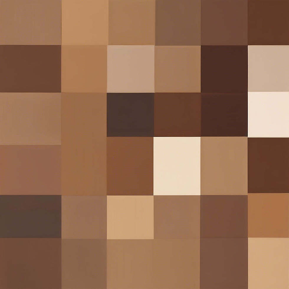
Ah yes, brown. That’s a mix of red, yellow and blue. We can use any of our six colours to tilt the brown in a myriad of different directions, and we can add white so that we start to see cream (with lots of white), beige (with a bit less white) and dark brown (no white).
Brown is a tricky one because we tend to dismiss it as not one of the most important colours, but due to its many component colours, it is possible to produce many different variations. This means that it is easy for us to mess it up and not get the brown we are after, but instead end up with a muddy mess, and there will be too much of it because we kept adding a little bit more of each colour to try to get it right, and all those little bits add up. Also, it’s challenging work trying to find the right combination when you have several components.
There's an easy solution - add a tube of brown to your stock. I use Burnt Umber because it’s nice and thick and solid. With Burnt Umber, we can lighten it with white as before. A bit of yellow will tilt it towards tan colours, whereas a bit of red will produce russet browns.
Remember – we don’t need Burnt Umber; we could manage perfectly with the first seven colours. It’s just there for our speed and convenience.
And then there’s Black

Black is potentially a problem. Artists will often tell you that you can, of course, use a pure black such as Lamp Black or Ivory Black, but it seems ‘dead’ against the other colours. It’s fabulous for monochrome work, and Titanium White will vary it from dark to light grey very easily. But if you want a rich, ‘living’ black, another way of doing it is to mix it. Burnt Umber and French Ultramarine do a decent job at mixing a nice black, and by varying the amount you can tilt it towards blue-black or brown-black. Again, pop in a little or a lot of Titanium White and you have all the greys your heart desires. Or get a tube of black! I have several, and I haven’t seen much difference between available blacks.
What other Colours are Useful?
I do use a few other colours, I must confess. This is a learning process and I’d be interested to know what other colours you like for oils. For example, I just completed the BBC Maestro portraiture course by the wonderful Jonathan Yeo, and he mentions Indian Yellow. I am dying to get a tube and try it out!
Here are some extra colours I do like and use a little or a lot:
Cadmium Orange – this is a beautifully pure bright orange, smack in the middle between Cadmium Red and Cadmium Yellow, and it saves time if you need an orange just to put some of this into the mix.
Viridian Green – it is perfectly possible to mix the bluish green I’ll call ‘French shutters’ using the aforementioned methods, but you might find it takes you a little while and some experimentation to get it right. No problem, Viridian Green will come to your rescue. A dash of Viridian with some white and you have your beautiful French shutters. Just be careful because Viridian is a very dominant colour and you only need the tiniest smidgen to have a big effect. I’ll talk more about colour dominance in a minute.
Magenta – the same principle applies as with Cadmium Orange. You can perfectly well mix a good magenta, but getting it out of the tube and then adding to it is quicker.
Naples Yellow – this is a pale, creamy yellow which is a good base for skin tones. You can add a dash of Alizarin Crimson or Cadmium Red for pink skin, or a bit of Burnt Umber for brown skin. You would rarely or never use it pure, but if you start three or four little piles with your palette knife and then add a few of those other colours, you’ll have a nice range of different skin tones available.
Yellow Ochre – I have never tried to mix Yellow Ochre because it is a strong, mustard yellow, dominant in nature, and it’s a famous colour for a reason – you can do a lot with it. Try it out and experiment.
Colour Dominance
You will find that some colours are more dominant in the mix than others. For example, use too much Alizarin Crimson and it will take over. Ditto for French Ultramarine. The best advice here is to be aware that some colours are more or less dominant, so a 50/50 mix won’t necessarily produce the colour you were expecting. After a while though, you’ll get the hang of it.
Drying Times
This simple palette is generally pretty good, with the notable exception of Burnt Umber, which skins over by the next day. Don’t put down much Burnt Umber on your palette unless you are intending to use it all that day. It’s also inadvisable to try and use the Burnt Umber by breaking through the skin. The skin gets in the mix and makes your paint go lumpy, which transfers itself onto the picture.
The next one to dry quite quickly is French Ultramarine, but it’s nowhere near as fast as Burnt Umber. After that, probably Alizarin Crimson. The others are quite slow. If you want to speed drying, Liquin is a useful additive, but beware using it on large areas as it makes the dry paint more shiny. Similarly, use Linseed Oil to slow it down and thin it out. This oil is quite expensive but you don’t need much – I use a small eye dropper to put a drip or two into a mixed colour if I think it’s too thick. This way your expensive oil will last ages.
Summary of the Recommended Colours
The essential bias colours, plus white:
1. French Ultramarine (violet-biased blue)
2. Cerulean Blue (green-biased blue)
3. Lemon Yellow (green-biased yellow)
4. Cadmium Yellow (orange-biased yellow)
5. Cadmium Red (orange-biased red)
6. Alizarin Crimson (violet-biased red)
7. Titanium White
The convenience colours:
8. Burnt Umber (dark brown)
9. Lamp Black or Ivory Black
The nice-to-have colours:
10. Cadmium Orange
11. Viridian Green
12. Magenta
13. Naples Yellow
14. Yellow Ochre
Of course, you can add your own favourite colours, such as Rose Madder, Vandyke Brown, Sap Green and Paynes Grey. The choice is huge. These are just my suggestions to get you started, but all you really need are the six bias colours plus good old Titanium White.
Here’s a short video summary showing what we can do with the six bias colours, even before we add white or start adjusting the amounts that we mix.
Have fun with your mixing!

Really informative Blog Richard, a great read! I look forward to reading the next one.
This is a brilliant colour resource, thank you for taking the time to put it together.
Great comprehensive guide Richard.
Lovely portrait of your dear departed friend John.
I have some Indian yellow looking forward to trying it out.
Very useful thankyou!